
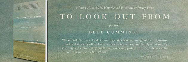
Book designer, publisher, writer—Living with Crohn’s/Colitis book and Cookbook, Healing Herbs, The Good Living Guide to Beekeeping, The Organic Composting Handbook, Questions for the Dalai Lama, and two poetry collections: To Look Out From and The Meeting Place. I’m also a public radio and print opinion commentator; married to musician and English professor, Steve Carmichael; mother of Sam, Emma, and Joe Carmichael. I live in a hand-built, solar-powered home in southern Vermont. Welcome to my website and I hope you enjoy it . . .

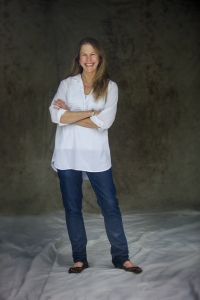
DCDESIGN was established in 1996 in Brattleboro, Vermont, by Dede Cummings, a published poet and Brattleboro resident for the past 30 years. Cummings moved to Brattleboro after five years in Boston at Little, Brown & Company. Brattleboro had long been a draw for Boston and New York book designers: the quality and customer service at the various type houses was legendary, and The Book Press was a top printer in the industry. DCDesign enjoys a national reputation within the publishing industry for high-quality work, gearing up for success in a new era of publishing with a focus on working individually with authors to bring their books out professionally and with global distribution. We have full- and part-time staff, including editors and proofreaders, indexers, web development, and a burgeoning marketing and publicity team We love traditional typography, but are not afraid to innovate. Cummings was trained as a letterpress printer, so her love of kerning, letterspacing, and ligatures is based on hot metal experience.

DCDESIGN Books has a number of book deals completed and in the works. Dede’s passion for good writing comes through in how she approaches her work, and the books she champions are tightly edited and presented to the book trade and film industry as finely-tuned works. One tenet of her representation is believing in the work—the words of each author ring true for personal transformation and the team at DCDESIGN shares this mission of bringing these voices out to the world so others can benefit from their stories.
Editorial support is from Rose Alexandre-Leach, Charlotte Williams, Cathryn Lykes, Sarah Ellis, Ferne Johansson, and Michael Fleming—all topnotch editors and proofreaders. Freelance designers are also available, while Dede works as the lead designer. One thing that sets our agency apart, is the control of design (interior and cover), and the complete packaging of each book to reflect and build on the author’s brand. We also create eBooks, audiobooks, and design interactive blog-websites with Twitter, Instagram, and Facebook pages to support publication.

Here are a few links about writer, book designer, and publisher Dede Cummings:
About Me page, Lean In (essay), Hunger Mountain Review (profile), Seven Days (book review), Vermont Arts & Living (profile) https://vermontartsliving.com/?p=69510 ~ Vermont Woman magazine (feature) ~ Best American Poetry (feature)
Dede Cummings, Commentator, VPR
DCDESIGN ~ Home office / 34 Miller Road, West Brattleboro, Vermont 05301~ dcdesignteamvt@gmail.com ~ 802-380-1121 ~ Follow on Twitter, @dcdesign1 on Instagram
Thanks for visiting ~
