
The process of book cover design, my love of designing poetry, and the challenges of nailing a good cover. For the design of the cover of David’s Inferno, I wanted to create a cover that might cause people to react—my hope is that they would feel uneasy with the lack of a horizon (I was playing around late one night and flipped the bottom photo of the labyrinth upside down), and they would wonder about walking into the woods. . . think Hansel & Gretel (getting lost/no way out) . . . And the best part is the cover still invites them to read the book because the type tells its own story.

Designing book covers is really quite hard. One must have the manuscript to read, a knowledge of history, the writer, the times, and of course typography. Creating a good cover is often the reason the book sells, so there is a lot of responsibility. I will post a few collages of covers I have designed to give you an idea of how varied my job is here.
I usually do 3 finished comps, and often the publisher or self-published author will want a combination of the three, or just pick one (if you nail it). Sometimes (very rarely) they don’t like what you do, and go find another designer. Other times, we are required to create additional comps for scrutiny — I don’t mind doing this all, and relish the collaboration. When I work for Alice James Books, or Tupelo Press, often the author has a say in the cover process. Well, and of course, there is one author who always had a say . . .
Mary Oliver
I have been fortunate to design many book covers, and interior page designs for the poet, Mary Oliver. Mary does have say on what goes on her covers, and how they look. She, in fact, worked with me to make sure the interior poems were shaped, and the line indents were perfect. Designing poetry is my favorite typographical work as a book designer. Of course, handset ting the type for a poem is my real passion, for every letter, every word, is kernel and slipped into place by your very hand (well, not really kernel, but it sounds good!); the words become lines, the wading is adjusted, the page is measured, the balance of art and symmetry is adjusted…. And the end result is a quiet collaboration of paper, print, type, block print, color, and light. My friend, the late Dan Carr, was a punch cutter, poet, editor, designer, type designer (Chenau is one of my favorites), and he was always quoting William Blake to me— and I just thought of a line from Blake’s Songs of Innocence and of Experience:
“In the universe, there are things that are known, and things that are unknown, and in between, there are doors.”
 A note on the type of Mary’s books—she always loved Perpetua, and asked that I use that after I typeset her New and Selected Poems, Volume 1. One caveat with Mary: I had to make the italic in the 12 point perpetual poem text ONE POINT LARGER (no ifs, and or buts!), so 13-point for the italic lines, or words in all her poems. She had a sharp eye—not just for words or the shape of her poems, but for type itself. Working on House of Light was a joy for me from start to finish. I selected a painting by a Provincetown artist, and was able to keep the cover spare but elegant. The cover for Thirst was a collaboration—often I will design and typeset the interior, and the cover design and typography comes out of that. It is wonderful work that I never tire of.
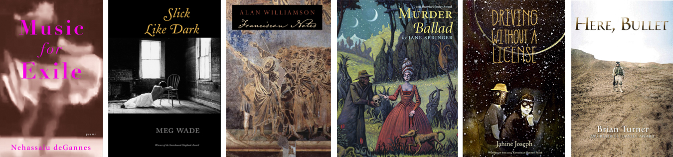
Some recent book cover samples are from Tupelo Press and Alice James Books.